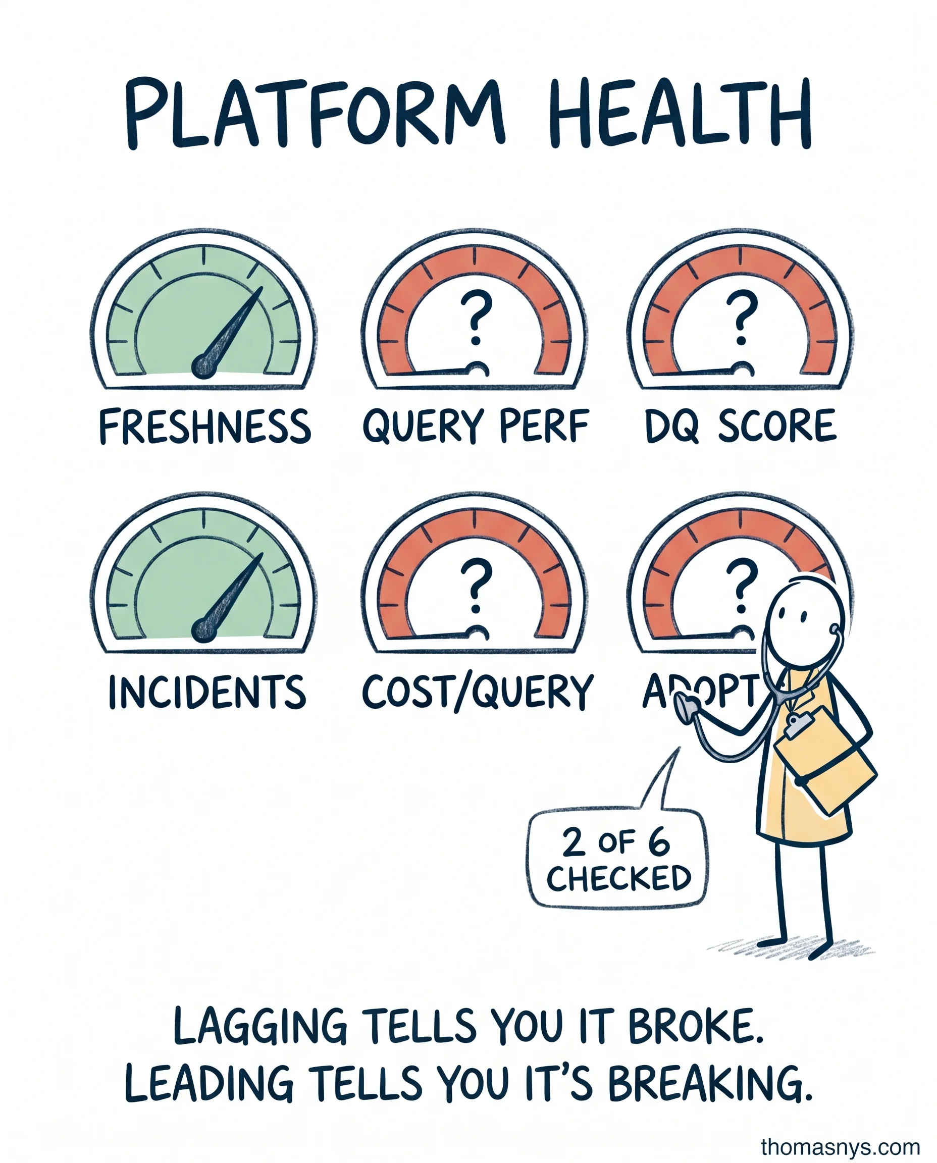
Your data platform has 6 vital signs. Most teams only check 2 of them.
Your data platform has 6 vital signs. Most teams only check 2 of them.
Most data platform health checks track incidents and uptime. That’s it.
If incidents are the only metric, you find out about problems after users do. The incident already happened. Someone already noticed.
The 6 vital signs that actually tell you the health of your platform:
Pipeline freshness - how stale is the data when it lands? Target depends on use case, but you should know the number.
Query performance - p95 query time, trended. Going up = capacity issue or query degradation. Catch it before users complain.
Data quality score - tests pass rate, by domain. One number per domain, not one number for the whole warehouse.
Incident frequency - the autopsy metric, but at least categorize: schema, infra, quality, human error.
Cost per query (or per workload) - lagging indicator of efficiency. Going up = somebody wrote a bad query, or scale changed and nobody noticed.
Adoption rate - active users / monthly active users on the platform. The metric most teams skip. If usage is flat or declining, your platform is dying. Quietly.
Leading vs lagging matters here. Incidents and cost per query are lagging - they tell you something already broke. Freshness, query performance, adoption are leading - they warn you before users notice.
If you only check the lagging ones, you only know after the fact.
One-page scorecard. Reviewed monthly. That’s it.
Which of these 6 metrics does your team actually track?
Fractional Data Architect helping startups and scaleups build data platforms that scale.
More about Thomas Nys →