Observability Blast Radius
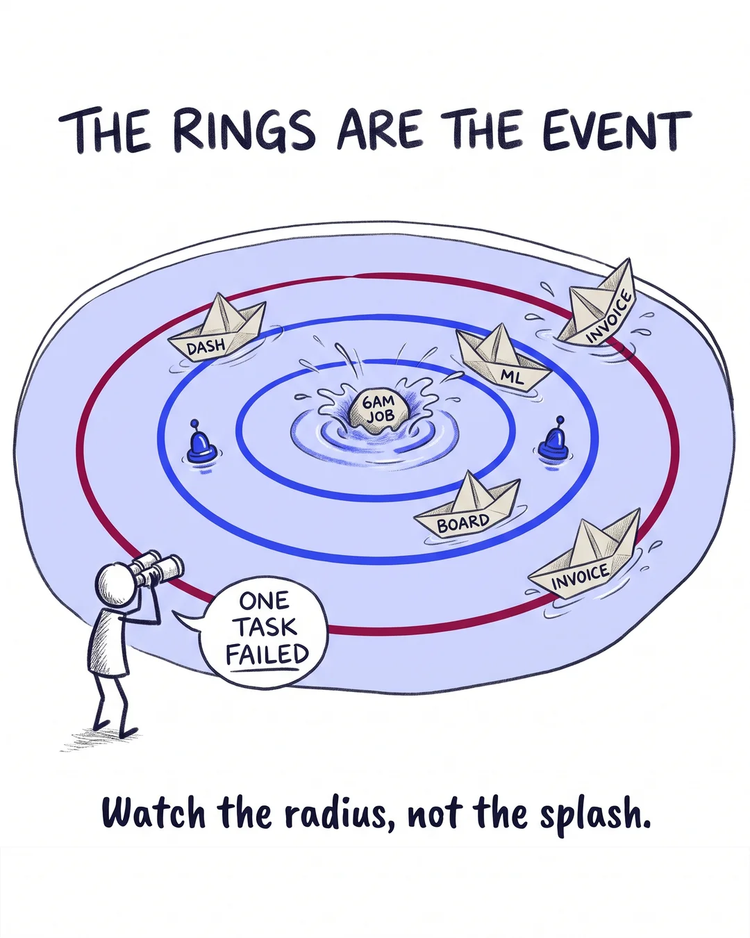
A failure that cost one dashboard last year now takes out 40 downstream jobs. The platform grew. The alerts didn’t.
The pattern shows up in most scaling platforms. Orchestration graphs grow quietly: every new model, report and ML feature adds edges. The alerting stays where it started, on task success, sized for the platform of 2 years ago.
Blast radius is measurable: for each node, count its transitive downstream consumers. Run that once and the graph reorganizes in front of you. A handful of hub tables sit under everything, and some cheap-looking job at 6am turns out to carry the board pack.
What expanding observability with the graph looks like:
- Lineage-aware alerts. A failure message that says what’s downstream, so 3am triage starts with impact, not archaeology.
- SLAs on the hubs only. Guarding 10 hub tables usually covers most of the radius; guarding 400 tables covers your team in noise.
- On-call scaled to radius. The hub tables’ owner rotation is staffed like the production system it is.
Checking every table is the opposite failure mode. Radius tells you where the guards earn their keep, and where they’re noise.
Do you know which of your tables has the largest blast radius, with a number attached?
Fractional Data Architect helping startups and scaleups build data platforms that scale.
More about Thomas Nys →