Choosing between 3 data platforms? Stop comparing demos. Here's the radar chart
Choosing between 3 data platforms? Stop comparing demos. Here’s the radar chart that makes it objective.
Most vendor evaluations come down to two things: the best demo, and the friendliest sales rep.
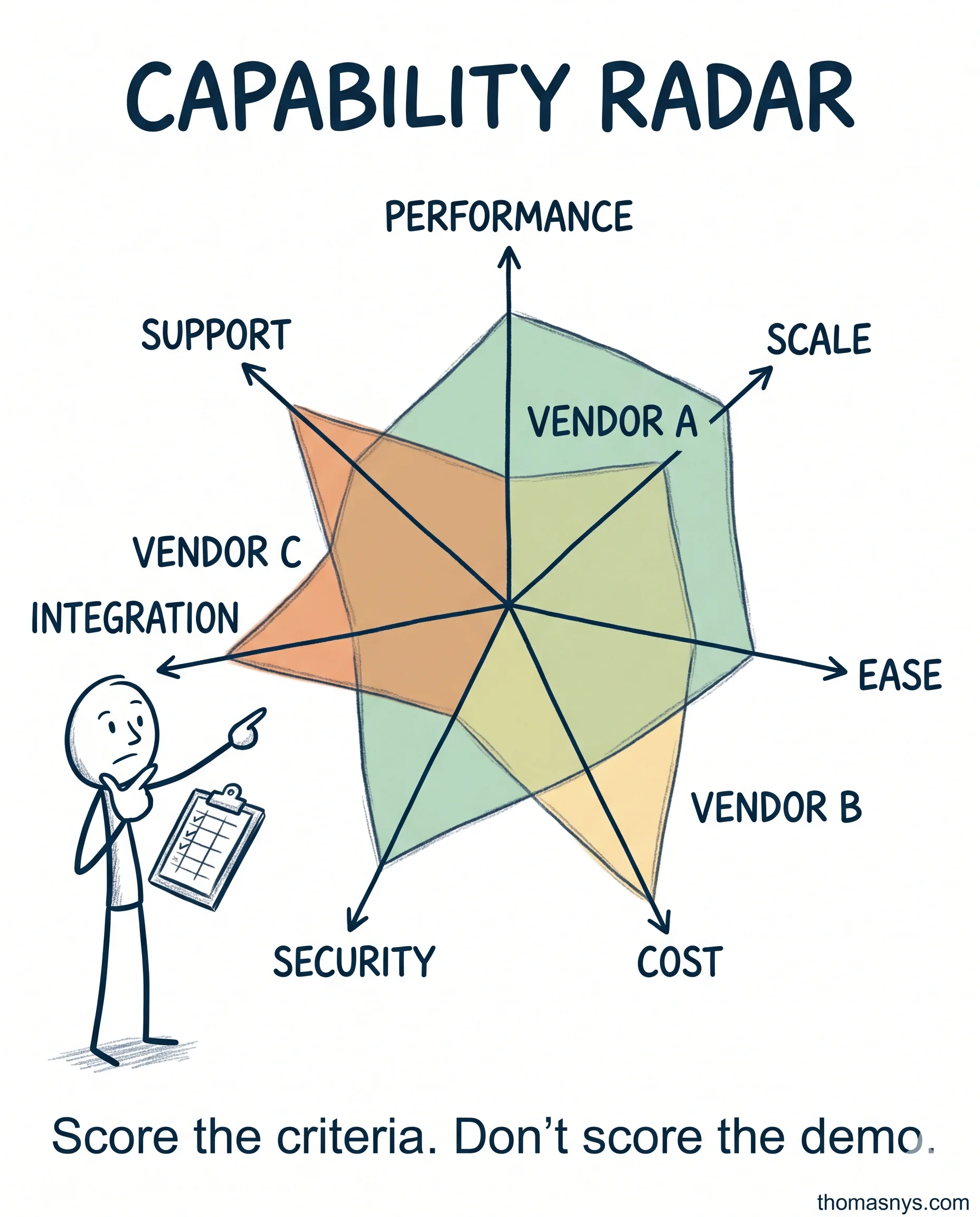
The Capability Radar fixes that. Pick 5-8 criteria. Score each vendor 1-5. Plot it as a spider chart. Larger polygon wins. Balanced shape = consistent. Spiky = strong somewhere, weak somewhere else.
The criteria most teams pick: Performance, Scalability, Ease of Use, Cost, Security, Integration, Support, Community.
The twist most teams skip: be data-driven about the scoring. “Ease of use” doesn’t mean what the engineer thinks - run the demo with your actual business analysts. “Cost” isn’t the list price - run pricing on YOUR projected workload.
Real example. Snowflake vs Databricks SQL vs BigQuery. Snowflake had the largest balanced polygon (ease of use + support strong, no major weakness). BigQuery spiked toward cost. Databricks spiked toward integration ecosystem. The decision: Snowflake. The reasoning: “Our 40 analysts need ease of use. Training cost matters more than per-query price.”
Where I see this go wrong: people use it for 2 options (just use a table), or they pick 12 criteria (unreadable), or they pick criteria that aren’t independent (cost and licensing both penalize the same thing twice).
And document the methodology. “We chose Snowflake because the polygon was bigger” doesn’t survive a CFO challenge. “We chose Snowflake because on a workload-weighted score across 7 independent criteria scored by 3 reviewers, it scored highest” does.
How did you choose your current data platform? Was it the best demo or the best fit?
Fractional Data Architect helping startups and scaleups build data platforms that scale.
More about Thomas Nys →